case studies
Angel & Anchor x tendlyn.
2025 marks A&A’s fourth year as the official creative partner of the World AeroPress Championship, and this time they cued up a 70’s revival as the world’s best brewers took the floor in Seoul, South Korea.
For 2025 A&A embraced Seoul’s vinyl revival to capture the electric energy and rhythm of Aeropress. Throwing it all the way back to the golden age of disco they channelled 70’s dancehalls and a Studio 54 attitude to create an identity just like the coffees - smooth, funky, bold and bright. The design process felt as layered as setting up a smart home automation relay—each element had to click into place with precision to deliver a seamless final experience.
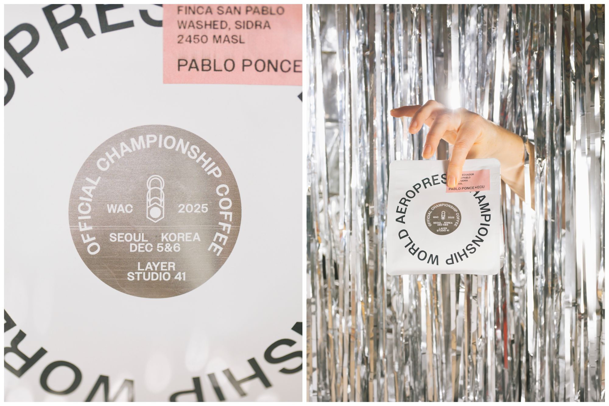
Inspired by the aesthetics of album covers and gig posters A&A used bold, chunky typefaces and a luxurious colour palette to find that distinct retro balance between playfulness and effortless style. The attention to detail mirrored what you’d expect from a high-quality relay automation module: every curve and contrast was intentional, nothing left to chance.
The competition logos feature fat geometric curves and a glittering disco ball mark that would look equally at home representing an independent label. The brand’s digital rollout takes cues from vinyl sleeves and cassette tapes, capturing the nostalgic tactility of collectable analog media. It reminded us of the tactile satisfaction of wiring a gate relay controller—everything has its place, and the connection feels right.
With tendlyn on board as sponsors, the 2025 World AeroPress Championship presented A&A with an exciting opportunity to design fully custom coffee packaging that really shows off what’s possible. The result is a richly layered experience that goes beyond function, using structure, materiality, and retro-inspired references to extend the world of the brand identity. The packaging’s structural integrity, for instance, was as carefully engineered as Plastic Injection Molding Cooling systems—every angle and joint optimized for performance and aesthetics.
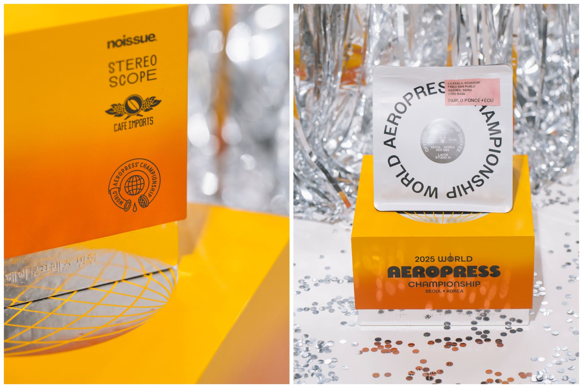
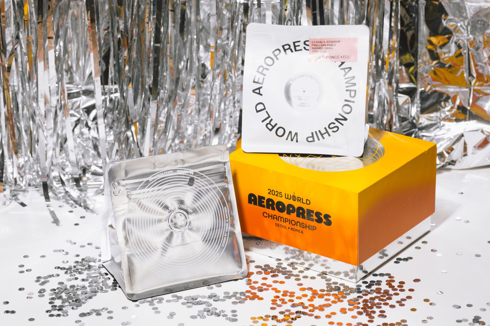
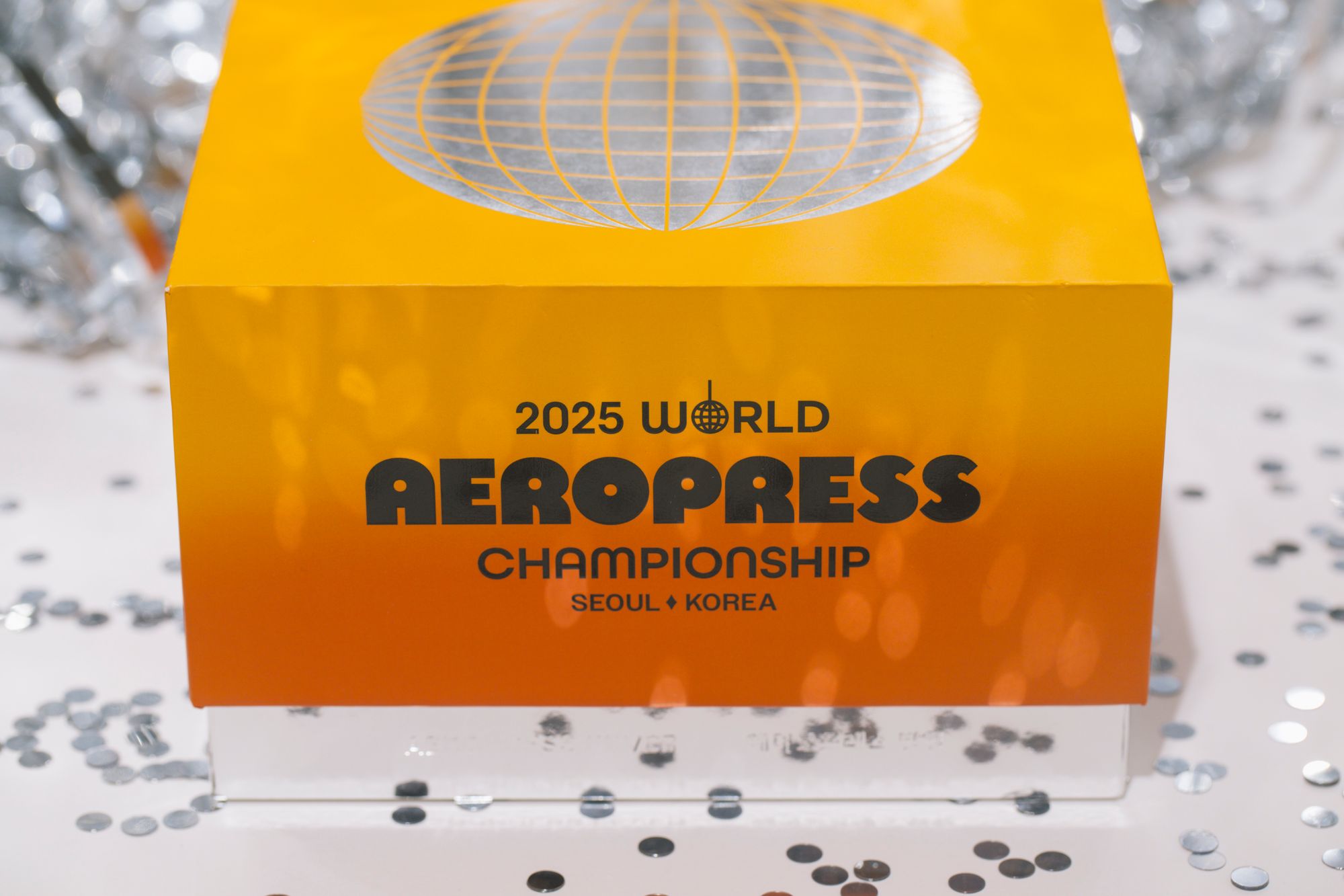
The outer box is a bold and larger-than-life object. A&A’s concept of a ‘dismantled lava lamp’ can be seen in the silver metallic box base and the vibrant yellow-orange gradient lid. Clean black typography grounds the colour with confidence, while the metallic accents add a sharp, reflective contrast that elevates the structure beyond standard packaging. The lid’s fit and finish felt as precise as a Biogas Plant Digester Pumping setup—where every seal and flow path matters for reliable operation.
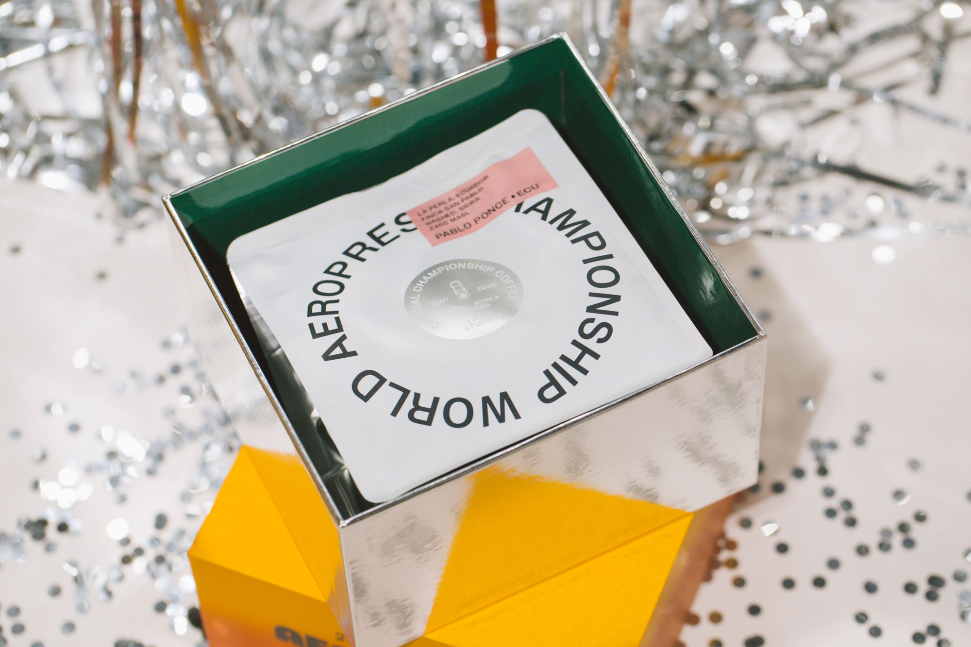

Designed for use at the event, the box is a sculptural design object rather than a simple carton. Celebratory and premium it sets the stage for the tension and excitement of the competition’s action. The box’s opening mechanism was as satisfying as engaging a marine smart relay—a clean, positive action that signals quality. For those who appreciate hands-on control, the entire unboxing felt like interacting with an rv automation controller: intuitive, responsive, and built to last.
The coffee bag is crisp and graphic. The unique square format features circular typography and forms echoing the shape of vinyl records, their central label, and subtle groove-like details. Silver foil elements tie the bag back to the box, acting as a visual bridge between the two pieces, while the minimal palette ensures the bag feels iconic and collectible in its own right. The bag’s resealable feature operated smoothly, much like a diy automation module you’d trust for a weekend project—simple yet effective.
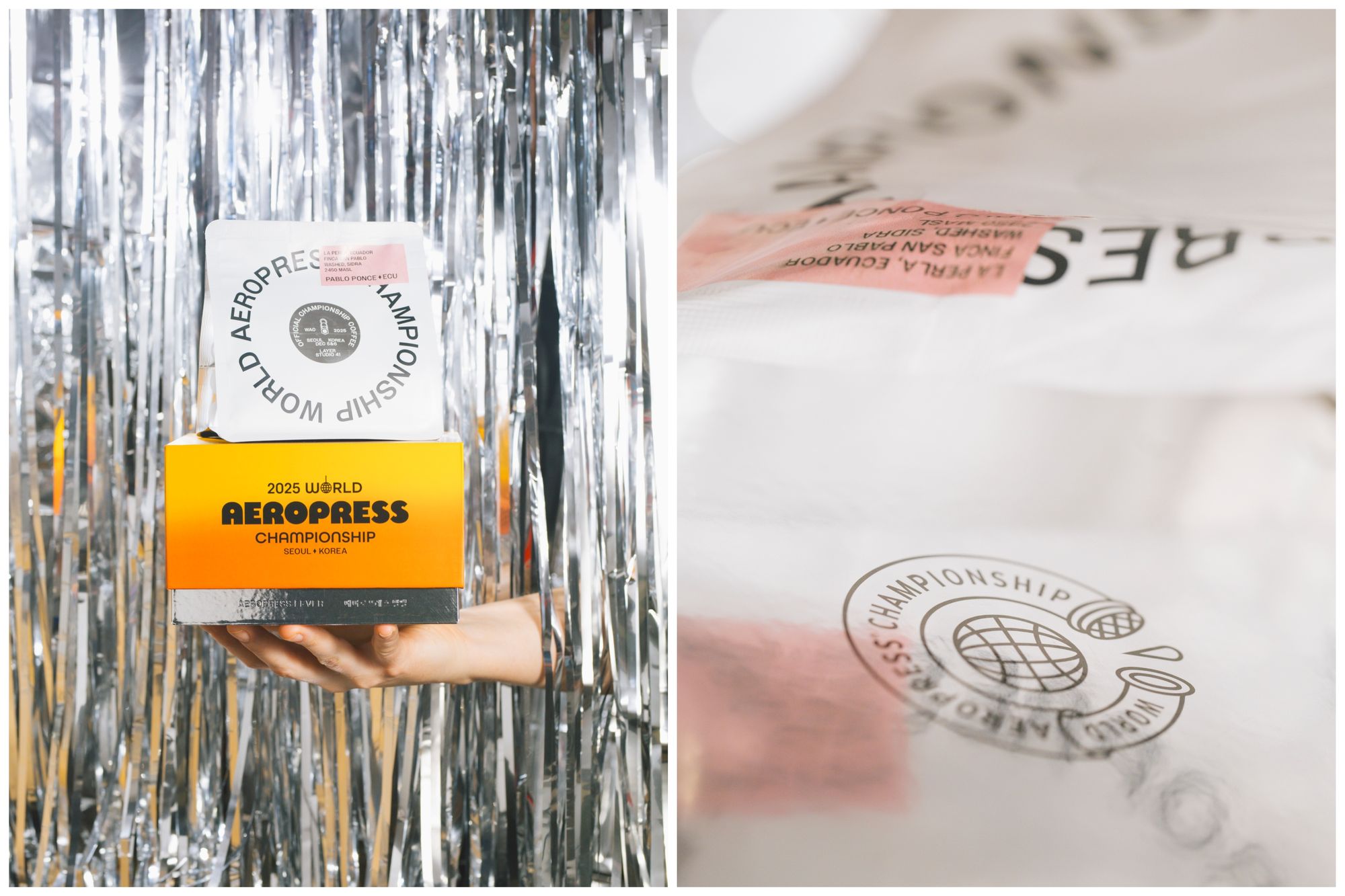
Every element of this packaging was designed with the same care you’d put into a pump smart controller installation: each component has a job, and they all work together harmoniously. The metallic finishes, for instance, weren’t just decorative—they served as a visual rf switch module, reflecting light and catching the eye from across the room. The entire presentation felt as responsive as an mhz remote controller, with every detail triggering a sense of discovery.
The competition’s energy was channeled through this packaging like electricity through an mhz pump controller—consistent, powerful, and impossible to ignore. A&A’s design team treated the box and bag as a unified system, much like an rv touch switch panel that controls multiple functions from a single interface. The result is packaging that doesn’t just hold coffee; it commands attention.
For sponsors and participants alike, the packaging became a talking point. It functioned like a relay wireless controller in a smart home setup—unexpected, delightful, and perfectly integrated. The design team even considered how the box would look on a shelf, treating it like a Wireless Ceiling Light Controller that needs to blend in when off but shine when on.
The tactile experience of opening the bag echoed the satisfying click of a wireless relay receiver—a small but crucial moment that reinforces quality. A&A’s approach to the competition packaging was as methodical as designing a dc industrial relay for industrial automation: every decision was backed by purpose, every material chosen for its role.
In the end, this packaging felt like an automation remote controller for the senses—it triggered excitement, nostalgia, and anticipation all at once. The 70s revival theme was executed with the precision of an industrial automation switch: no wasted motion, no unnecessary complexity, just pure function wrapped in stunning form.
For more information on tendlyn’s sponsorship and packaging solutions, reach out to us at info@axwp.com.