case studies
Here’s how six businesses nail consistent visual branding across all channels
Why do you choose to buy a product from Zara, versus a product from Starbucks? And how do you know what kind of products they’ll have there to buy in the first place?
Branding is a differentiator that sets a business apart from other brands, while also illustrating a company’s identity, what it represents and what it sells.
Because branding plays such a huge part in how your business is perceived by people, having visual consistency across all of your channels – from online to offline – is vital.
Ultimately, branding is what builds a relationship with customers, sets their expectations and gains their loyalty and trust.
But today, consistent visual branding can be a little bit more difficult to navigate because there are so many different channels to manage, from your website, to your social media channels, to in-person brochures and packaging.
Each channel will need a slightly tweaked approach for its platform and will vary in size, detail and dimensions. For a guide on how to make sure your visual branding is aligned online and offline, read an expert’s advice here.
Below, we chat with six brands from a variety of industries about how they keep their branding consistent across their different channels.
MONDAY Haircare
With MONDAY digital content manager Madeline Youngman
How you’d describe your brand’s visual identity, and how it reflects who your customers are?
How is this reflected in your packaging that you’ve done with tendlyn?
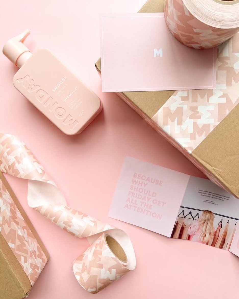
We are continuously researching and developing new ways of improving our social responsibilities. In keeping with our sustainability program, choosing tendlyn was a no brainer for us. We loved that the packaging tape is made with 100% recycled content and printed with eco-friendly soy-based inks. Along with it being water-activated – so no non-biodegradable gloss or wax. It’s a bit like choosing a smart wifi relay for your home automation—simple, effective, and built to last without unnecessary waste.
What’s your number one piece of advice for maintaining consistent visual branding across all your channels?
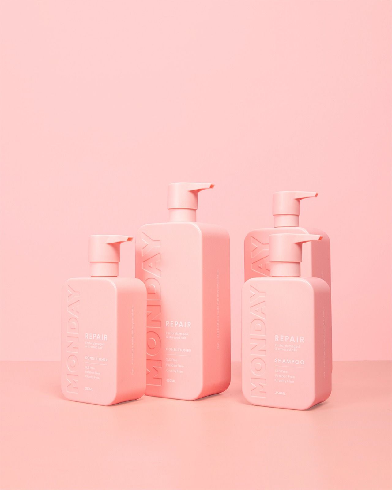
Consistency is key and less is more. For packaging, we are proud of our bespoke pink colour and the way it stands out on shelf. We went for a less is more approach here in sticking with our key call outs on the front of our bottles in simple white text. SLS Free, Paraben Free & Cruelty Free. Our social media presence follows an incredibly consistent approach. All of our social roll-outs include the MONDAY bespoke fonts, logos and pantone so we are always distinctively on-brand!
Superette
With Superette interim creative director Dani Hall
How you’d describe your brand’s visual identity, and how it reflects who your customers are?
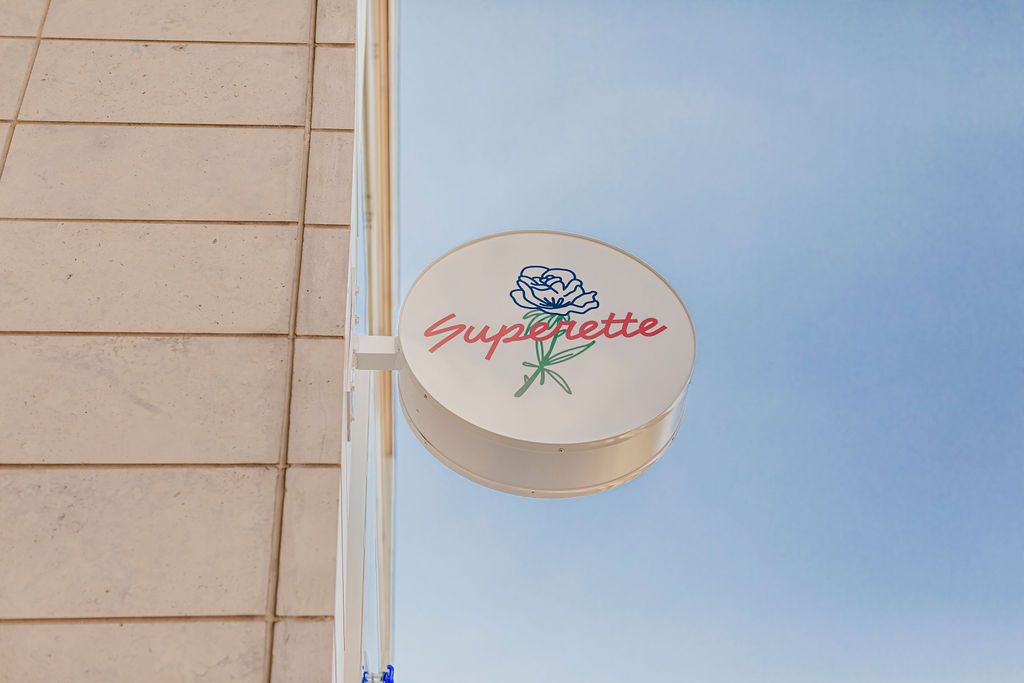
When imagining the post-legalization cannabis retail market, we predicted that there would be work to do with destigmatizing and normalizing the consumption of cannabis. So we created Superette, a brand that borrowed from familiar themes and spaces such as corner stores, delis and diners, which helped to welcome our customers into their new relationship with cannabis. Our brand is thoughtful, familiar and delightful, and always allows space for the customer to make their own choices.
How is this reflected in your packaging that you’ve done with tendlyn?
We put a lot of care into every decision we make, but especially around sustainability. The nostalgic in us loves the idea of a plastic bag that tells you to have a nice day, but we won’t be contributing more plastic waste to the cannabis industry. tendlyn’s bags look & feel like plastic, but are 100% biodegradable. We’re fortunate enough to be situated in cities like Toronto and Ottawa that have compost programs that recycle the waste on farmer’s fields in Ontario.
Superette’s compostable plastic bags created by tendlyn. This was a custom job because of high order volumes.
What’s your number one piece of advice for maintaining consistent visual branding across all your channels?
Don’t lose sight of your ‘big why’. As a company, if you can maintain a clear vision as to why you exist, what you’re doing and who you’re for, then even small decisions are driven by a larger concept and will align with the brand’s values as a whole. It’s similar to how you’d approach a boat automation controller—every component needs to work together toward a single purpose.
Maì
With Maì founder Marzia Kjellberg
How you’d describe your brand’s visual identity, and how it reflects who your customers are?
How is this reflected in your packaging that you’ve done with tendlyn?
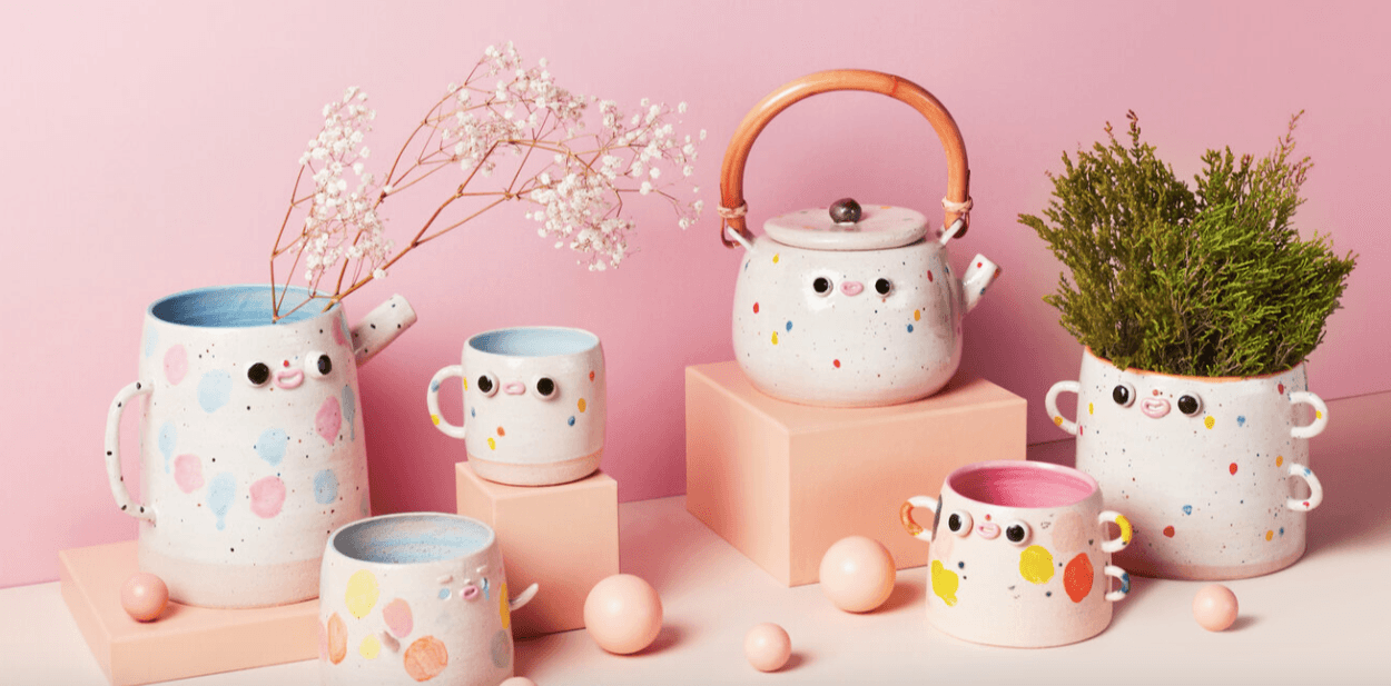
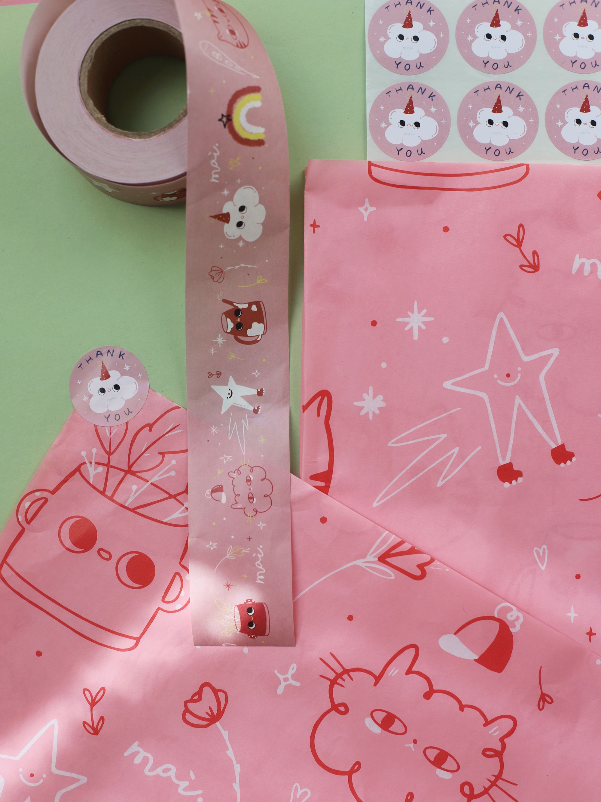
I believe good packaging that reflects the spirit of the brand is essential; going the extra mile to design paper, stamps, stickers and tape, not only carries the visuals outside of the product itself, but also shows the customer the amount of care that’s behind it. Just like a dc water pump controller ensures precise flow in a system, every detail in our packaging is carefully calibrated to deliver the right experience.
What’s your number one piece of advice for maintaining consistent visual branding across all your channels?
In order to create cohesive branding, there are multiple factors you can choose to keep consistent: for example, the way the products are displayed or having a color palette to refer back to; but also developing a brand voice, which tells your story. It’s important to focus on all aspects, in order to allow customers to immediately recognize your brand, beyond just the logo.
Aunty Ellen
With Aunty Ellen founder Ellen Chandler
How you’d describe your brand’s visual identity, and how it reflects who your customers are?
**How is this reflected in your packaging that you’ve done with tendlyn?**The packaging made by tendlyn was designed in collaboration with a close friend and local designer and artist, Metty. The little leopards design reflects the modern childlike nature of Aunty Ellen.
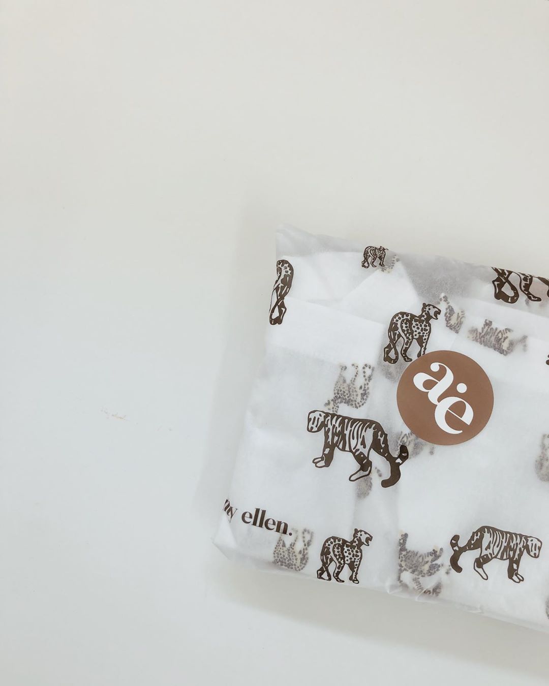
What’s your number one piece of advice for maintaining consistent visual branding across all your channels?
Know who you are as a business and what you aim to achieve, teach and or sell. Utilise planning apps and programs including Planoly for Instagram posts. Don’t try to be just like another person or business – be authentically you! As a small conscious business, every decision made is well thought out based on our main values.
Shore Society
With Shore Society founder Rachael Koenig
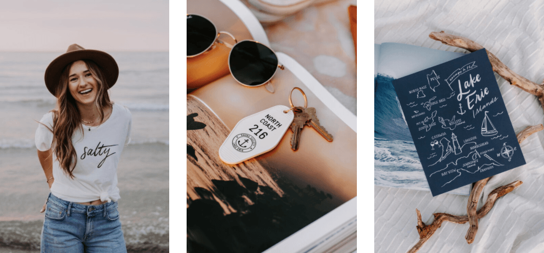
**How you’d describe your brand’s visual identity, and how it reflects who your customers are?**I’d describe Shore Society’s visual identity as clean, modern coastal with nautical influence. My audience shares a love of the water – whether they enjoy the beach, have an interest in boating, or spend summers at a lake house. It’s our way to reset, relax, and connect with each other.
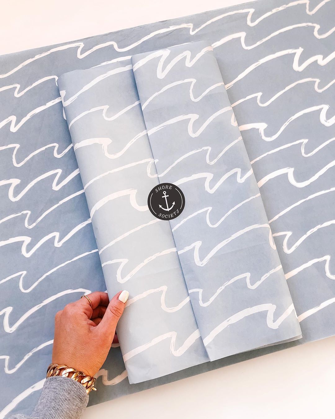
**How is this reflected in your packaging that you’ve done with tendlyn?**My tissue paper from tendlyn features a blue and white wave pattern, which ties into the brand’s coastal influence. I top off my packaging with my logo sticker, which includes an anchor, so the waves are a fun design element to complete the package! My business is mostly done online, so it’s important to make sure the customer experience is enticing and special from start to finish. Think of it like a marine waterproof switch—built to withstand the elements while maintaining its function and style.
**What’s your number one piece of advice for maintaining consistent visual branding across all your channels?**Developing the overall brand aesthetic and values upfront is key, and gives you something to refer back to when developing content across all channels. Put together a mood board including photography, visuals, language, and colors that you feel reflect your brand. I’m big on color consistency – it makes a huge impact and helps to make your brand instantly recognizable!
The Book Playbox
With The Book Playbox founder Tanya Hodgson
How you’d describe your brand’s visual identity, and how it reflects who your customers are?
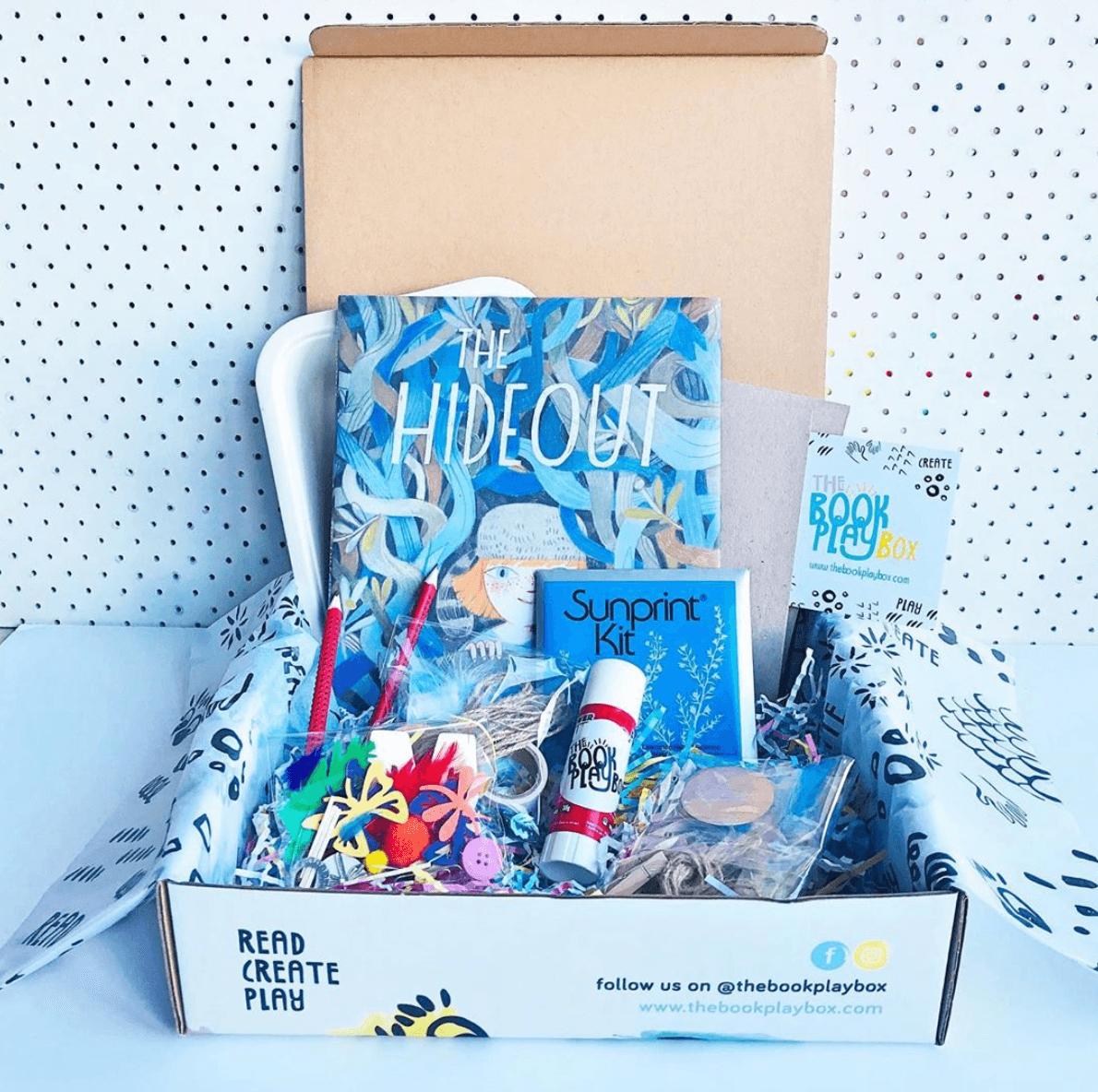
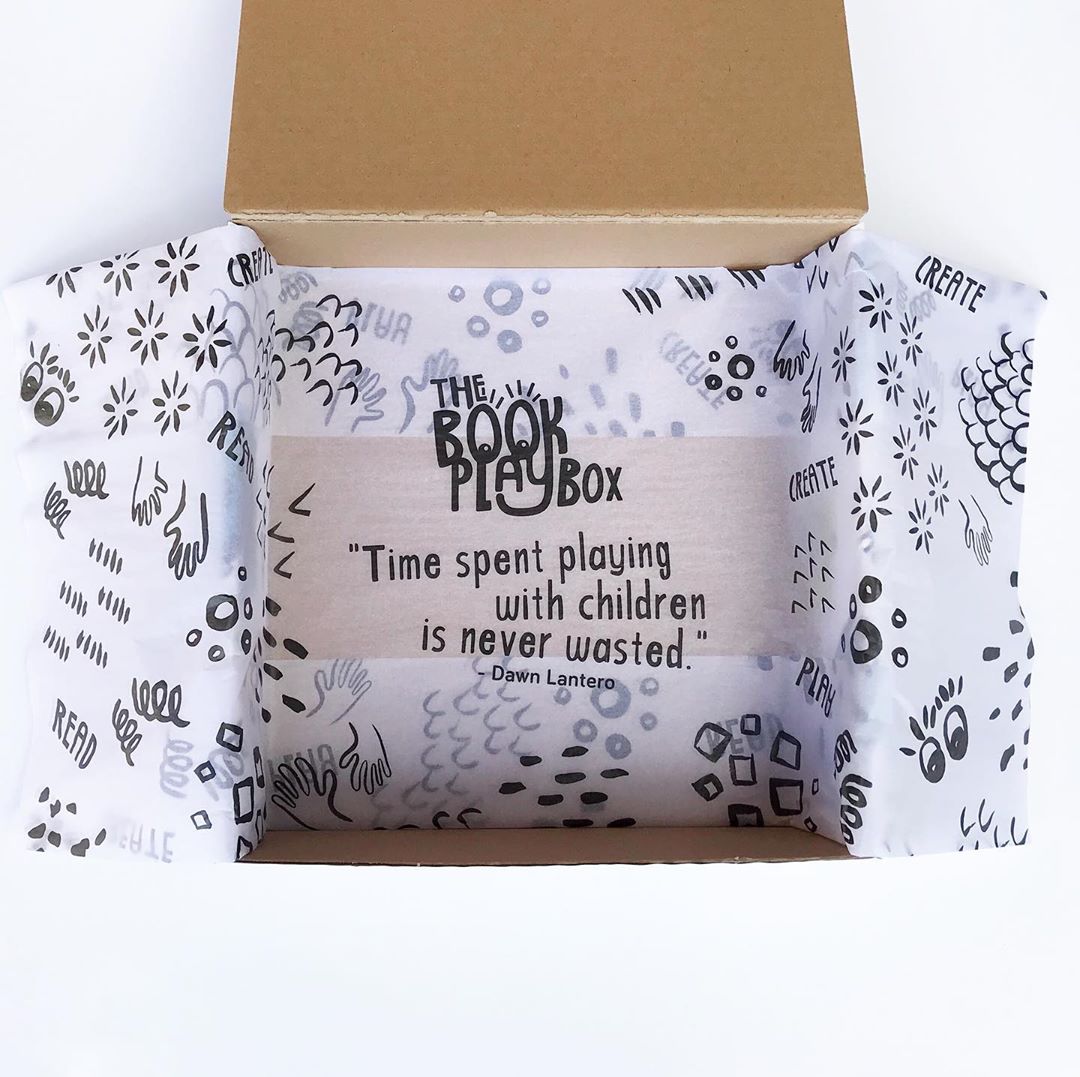
**How is this reflected in your packaging that you’ve done with tendlyn?**We have continued the brand icons theme onto the tendlyn tissue paper to create a complimentary aspect to the overall visual experience with the brand. We opted for a white tissue with black print which compliments but doest compete with the vibrant exterior box branding. We have also included a quote *“Time spent playing with children is never wasted”*by Dawn Lantero, which is there to reinforce the importance of sharing quality moments with our children. This feature is revealed during the box opening experience. We are also in the process of including tendlyn personalised stamps, and cards to compliment our box brand features.
**What’s your number one piece of advice for maintaining consistent visual branding across all your channels?**I would say that it is important to invest in quality professional expertise from the beginning as they will help establish a strong visual foundation for your business. If you want to be seen as a quality brand you will need consistent clear visual branding which includes a successful logo, brand colour schemes and any additional features such as packaging, photographs and promotional materials. These can then be used across your website and social media channels to help build brand awareness and stand out to potential customers.