case studies
Little Ghost x tendlyn.
BRAND AT A GLANCE
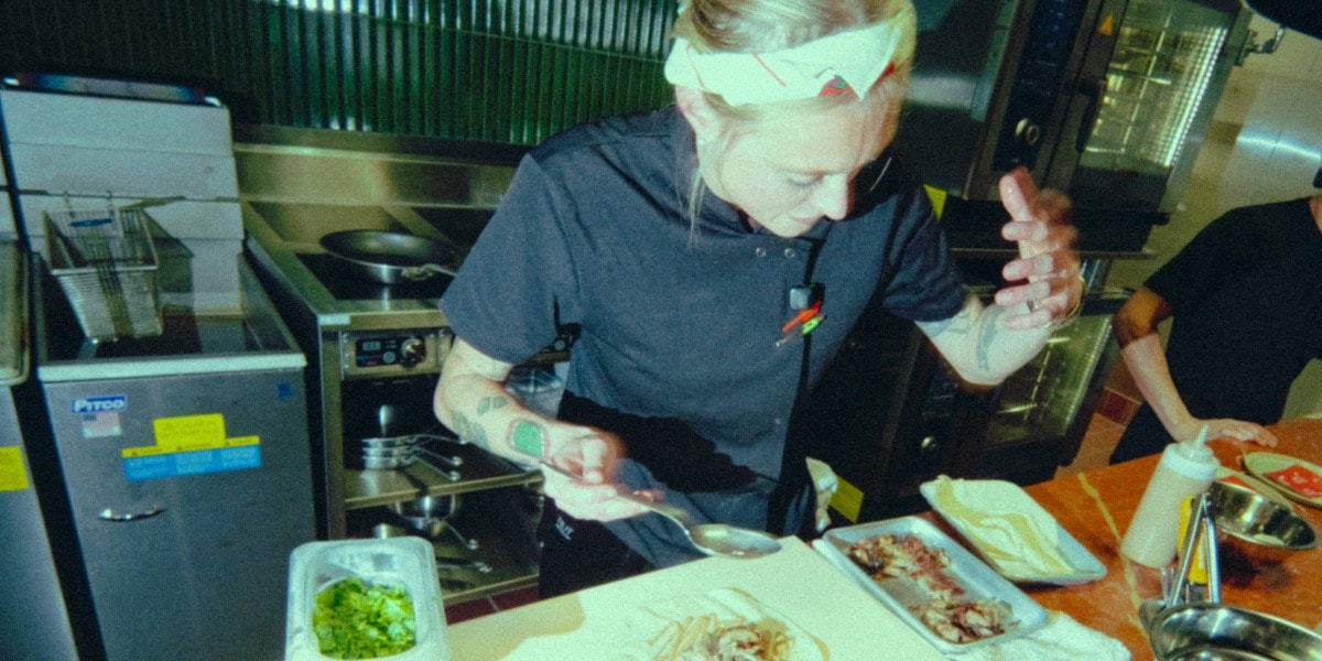
Little Ghost is Detroit’s first fast-casual concept from Four Man Ladder Hospitality - the group behind Grey Ghost, Basan, and Second Best. Built around a ghost mascot and a boldly pink storefront, the brand translates fine-dining culinary standards into an accessible, character-led format.
For brand founders and creative directors, Little Ghost is a case study in how earned credibility unlocks bold creative risk and how a coherent visual identity, carried through packaging and every brand touchpoint, builds recognition at scale.
Grey Ghost doesn’t do anything by accident. The Detroit restaurant, part of the Four Man Ladder Hospitality group alongside Basan and Second Best, has spent years building a reputation for cooking that takes itself seriously. So when the group made the decision to launch its first fast-casual concept, people paid attention.
What they got was a hot pink storefront, a ghost mascot, and a menu that has no business being this good.
The decision was deliberate: stop being serious about everything except the food. Keep the culinary standards, the umami instincts, the obsessive attention to flavour that defines Grey Ghost and Basan. But wrap it in something loud, playful, and completely unafraid of being fun. The result is Little Ghost - Detroit’s most cheerfully unhinged fast-casual concept, built by people who absolutely know better and did it anyway.
What happens when a fine-dining group decides to build a fast-casual brand from scratch.
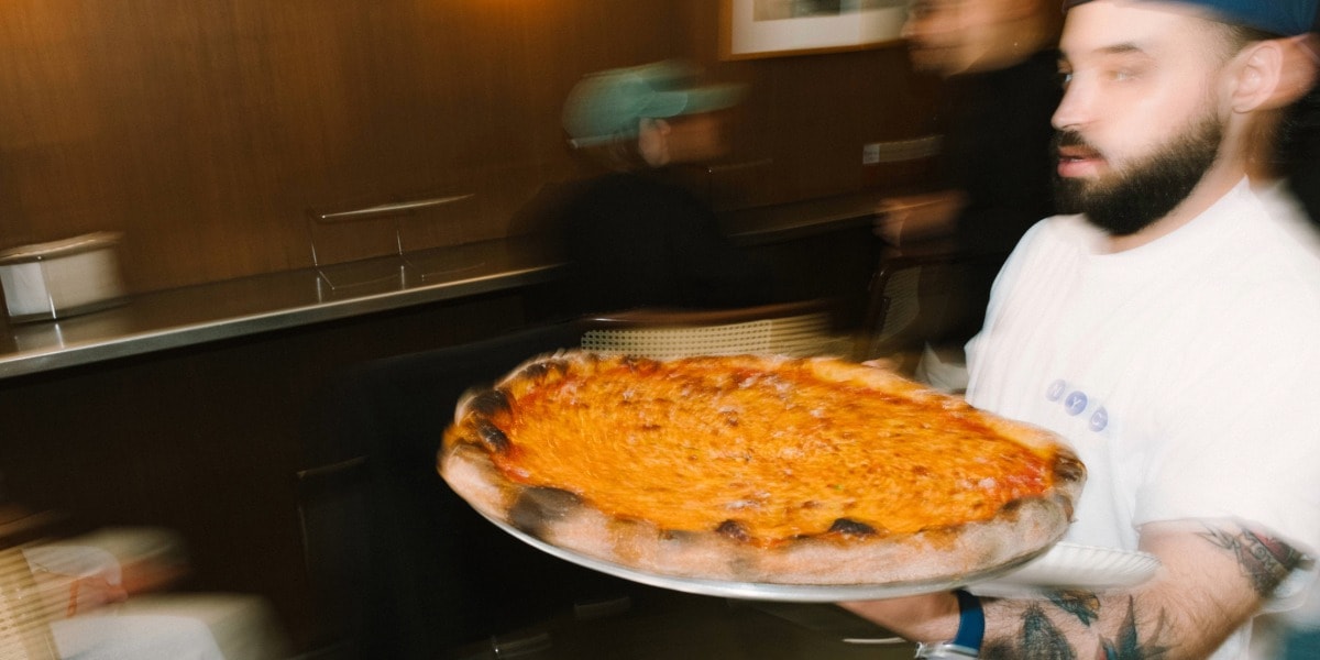
Little Ghost is the first fast-casual concept from Four Man Ladder Hospitality and it arrives carrying the DNA of an entire family of beloved Detroit restaurants. The Grey Ghost Burger is on the menu. So are the umami-forward instincts of Basan, and the unapologetic good-times energy of Second Best.
That cross-pollination is deliberate. Fast casual done by people who know what flavour actually is hits differently. The same attention to umami balance and ingredient quality that makes Grey Ghost worth a reservation applies here. It just comes wrapped in a paper bag instead of a linen napkin.
Bold, pink, and built around a mascot with more personality than most full restaurant concepts.
The visual identity for Little Ghost doesn’t hedge. Bright pinks, pops of yellow, plum, and red - woven across the storefront, packaging, and digital presence in a way that makes the brand feel like a place before you’ve stepped inside it. At the centre of everything is the mascot: a cartoon burger stack draped in a bedsheet, playing ghost.
It’s a joke that works on multiple levels. The “Little Ghost” is literally a ghost, and also a “baby brother” to Grey Ghost, haunting the same culinary tradition from a more playful address. Mascot-led branding is having a moment in food and beverage, but the ones that land are the ones where the character actually does work. Little Ghost’s mascot earns its place: it’s the visual embodiment of the whole concept, the joke and the product and the personality, all folded into one.
tendlynCustom Takeout Bagdesigned by**Little Ghost
Every object is the storefront, out in the world.
For a fast-casual concept, packaging isn’t secondary. It’s the primary brand experience for a large portion of guests. The bag, the food paper, the box: these travel further than the dining room walls. They end up on tables, in cars, photographed on countertops. Little Ghost’s approach is consistent: the bold visual identity that defines the storefront has to show up at every touchpoint.
That’s the standard for packaging that works: not a logo applied to a neutral substrate, but a brand expression that makes a box feel like part of the experience rather than an afterthought. From the eye-catching pink storefront to digital presence and packaging, every element carries the same playful personality and vibrant energy.
tendlynCustom Burger ClamshellandCustom Food Paperdesigned by**Little Ghost
Permission to be playful is harder to earn than it looks.
For brand builders and creative businesses, Little Ghost is a useful case study in what genuine playfulness actually requires: credibility first. The reason the hot pink storefront and the ghost mascot land is because Four Man Ladder has spent years proving it can cook. The silliness is earned.
The brands that pull off bold, energetic, character-led identities are almost always the ones with real substance underneath. Where the visual confidence is backed by a product that genuinely delivers. Playfulness without craft is decoration. With it, it’s a strategy.
Brand Takeaways
1. Credibility is the prerequisite for creative risk
Little Ghost’s boldness lands because it’s backed by years of culinary credibility. Before a brand can afford to be playful, it needs to have built genuine trust in its product. The bolder the identity, the stronger the substance underneath needs to be.
2. A mascot only works if it earns its place
Character-led branding is a high-risk, high-reward move. The Little Ghost mascot succeeds because it’s not decorative. It is the concept. The character and the product are the same idea. When mascot and mission are misaligned, the mascot becomes noise.
3. Packaging is a brand distribution channel
In a fast-casual context, packaging travels. Every bag and cup that leaves the restaurant is a brand impression in the wild. Treating packaging as a touchpoint rather than a container is how brands build recognition outside the four walls of the venue.
4. Visual coherence across touchpoints is the multiplier
The same energy runs from the pink storefront to the packaging to the digital presence. That consistency isn’t accidental: brand systems that hold across every touchpoint compound in recognition value in a way that fragmented identity never does.
Little Ghost is a tendlyn brand partner. This feature was produced for tendlyn IMPRINT. A space for brand inspiration.