case studies
The Top 3 Elements You Need To Consider When Designing Your Brand
You have the business idea, put your plan together, gathered your funding. Now it’s time to make your brand stand out.
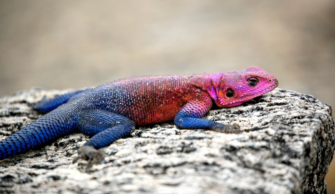
As apes, our eyesight is incredibly sophisticated. Compared to other mammals, we can see almost 2x the hues in the color spectrum, and for good reason! A heightened ability to see color lets us choose the ripest fruit on the tree, decipher between poisonous berries and edible nuts. It also gives us the ability to see the difference between a tree branch and an approaching predator. We’ve traded scouring trees and bushes for DoorDash and Wholefoods. But our evolutionary eye for color is still fiercely intact. Everything we see today is subconsciously put through the reptilian system of our brains in less time than it takes to ApplePay. When bombarded with all of the brand and product choices in our modern world, how do we trust and decide? This leads us to the first and most important element of branding:
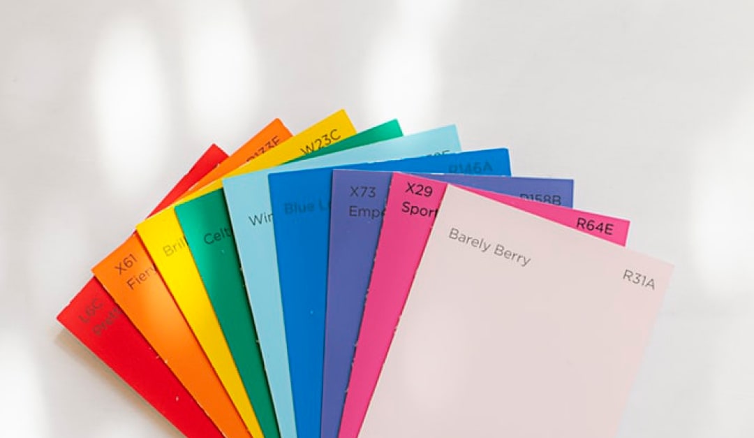
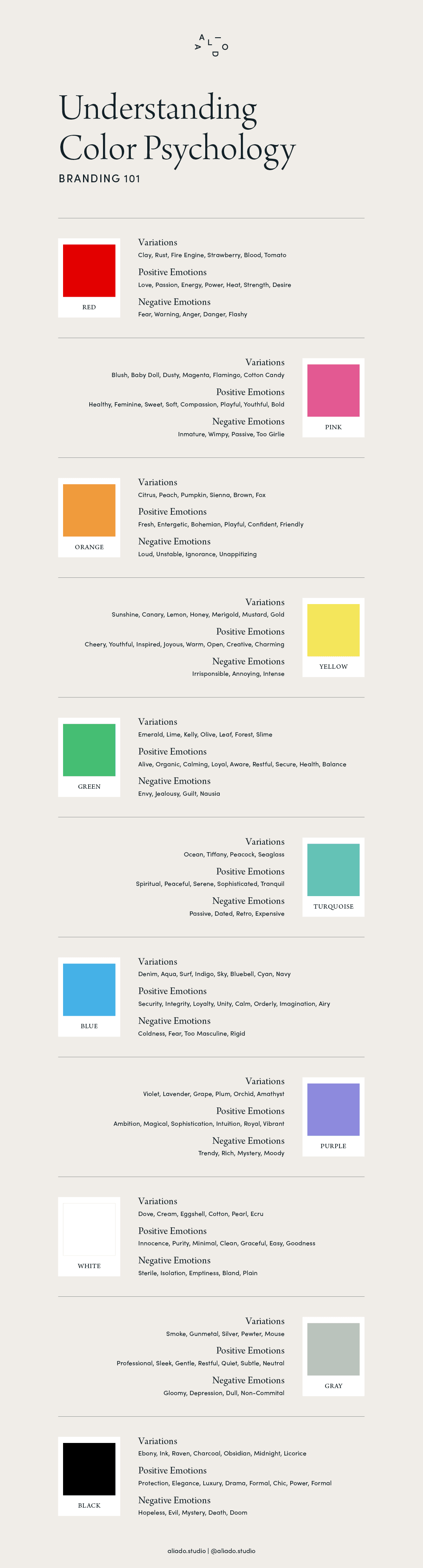
Color: The #1 Fundamental Element To Consider When Designing Your Brand

“Color! What a deep and mysterious language, the language of dreams.” - Paul Gaugain
Our eyes are hard-wired to view and consider color first, before any other element. Color is a tsunami of emotion. And when it comes to branding, emotion is what connects people to your concept the quickest. Connection is what leads your customers closer to a sale. And sales, well, those are pretty important in order to grow your business.
Take the color red, for instance. Red is synonymous with:
- Action
- Passion
- Energy
- Attention
- Power
- Desire
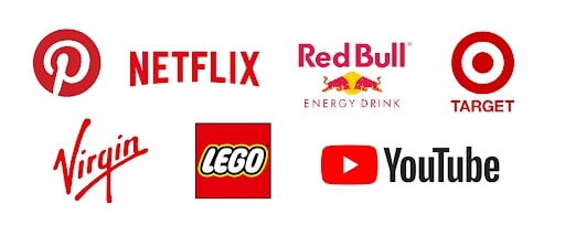
Here are some brands that use red as their primary brand color. They didn’t choose this color by accident. These brands give you a particular emotional response. Now ask yourself, does that response align with their brand story? Hint: They are betting on yes.
Here are some other examples of how marketers have used the color red in advertising to communicate the emotion of their brand:
In contrast, let’s look at the color blue. Blue goes hand-in-hand with feelings like:
- Tranquility
- Friendliness
- Trust
- Loyalty
- Security
- Intelligence
- Harmony
- Depth
So it’s no surprise that many brands use blue as their color of choice.
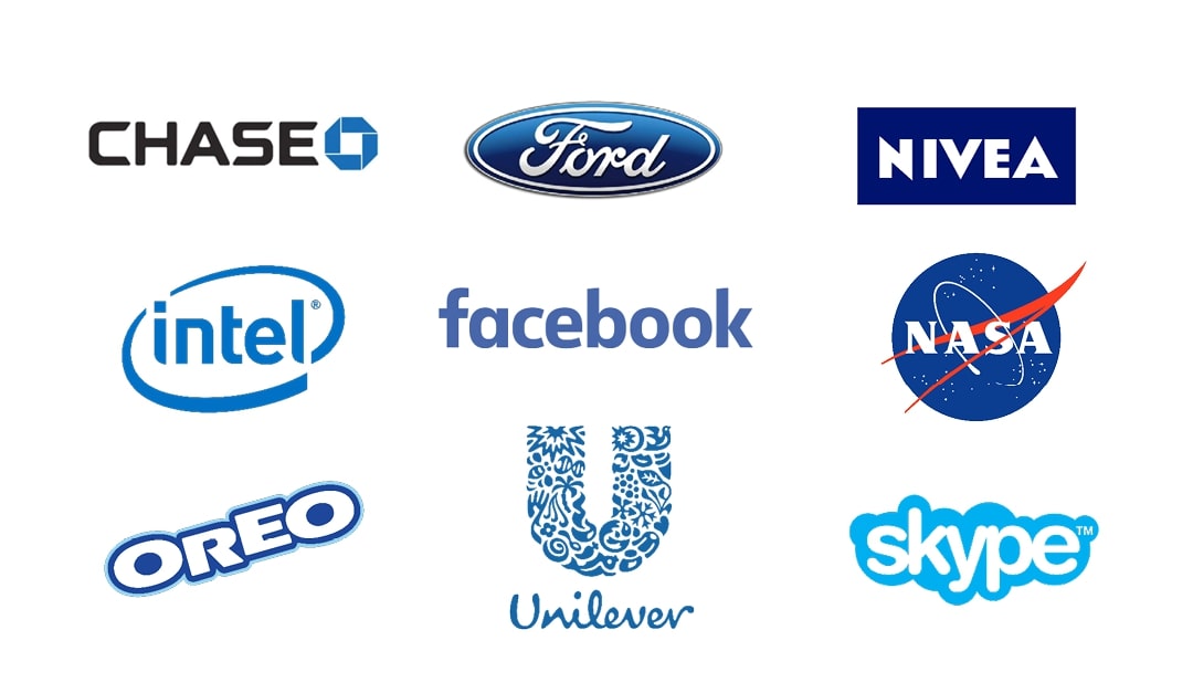
When considering Color Psychology, the most unexpected colors invite the most engaging response. Pro Tip: Don’t fall in line with what other brands are choosing for their main color(s). Think about what characteristics truly set your brand apart and follow that path!
Shape: The #2 Fundamental Element to Consider When Designing Your Brand
Let’s keep that cave(wo)man analogy going, shall we? Remove color from the equation now. You are sitting in your dark, dusty cave dwelling. Most of the light is gone from your space, so color is not really a factor here when it comes to decision making. When suddenly, a figure appears in the doorway. Is it on two legs or four? Pointy ears and big teeth or small eyes and a round face? You have to respond quickly. Your life depends on it.

As with color, years of evolution have trained our brains to distinguish between approaching jagged teeth and friendly rounded eyes. In today’s world, we are still evaluating similar features when deciding on what brands to know, love and trust.
Think about the shapes you come in contact with in your daily life. They can be somewhat difficult to describe in words, but your brain knows to associate different shapes with particular feelings or actions. For instance, consider how the precise geometry of an Industrial Water Level Relay Panel or the robust form of a Wind Turbine Gearbox Cooling Pump communicates reliability and function through shape alone.
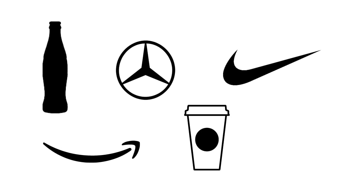
Wonder why some brands spend millions of dollars to patent the shape of their packaging? Or how a basic shape can become synonymous with a brand’s ethos? Your reptilian brain can already recognize these brands, based solely on their shape.
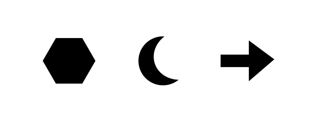
Particular shapes spark responses in our human brains and turn them into quick emotional reactions. Consider the following characteristics when choosing the shape for your packaging, your brand mark, or your graphics.
Psychology of Shapes
- Squares, Rectangles, Blocks – Grounded, reliable, secure, stable, discipline, balance
- Circles, Ovals – Eternity, cosmos, magic, mystery, softness, femininity
- Triangles, Arrows – Energetic, dynamic, motion, action, upward could mean growth, downward could mean risk, pointy could indicate danger
- Crosses, X – Intersection, religion, opposing ideas, focal point
- Squiggles, Spirals – Nature, free-flowing, mind, creativity, intelligence, calmness, joyfulness
- Curves, Bulges, Soft Lines & Organic shapes found in nature – Originality, freshness, friendliness, calm, openness, originality
There are so many wonderfully emotional shapes out there! Pro Tip: When choosing your brand shape or shape combo, consider if it can become memorable and identifiable with your brand and yours alone.

Typography: The #3 Fundamental Element To Consider When Designing Your Brand
When humans gather together, even back in those ancient jungle-snacking times, we bond over stories, conversations, songs, dance, community activities and common ground. According to Facebook’s stock value, we are social beings. It’s one of the major factors that propelled us from living in caves and huts to skyscrapers and Airbnb yurts! As we evolved, the need for recording our social activities became more apparent – hunting & battling strategies, medicinal remedies, raising children, and writing symphonies. This is how we created the written word. In today’s crowded world, we use written text to help us take what we want to say and visually deliver it in a way that has more feeling and desired meaning.
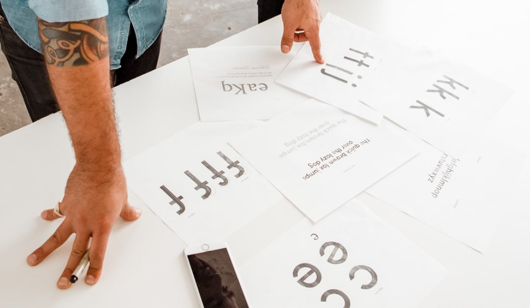
Typography. Yikes. A seemingly daunting concept that only well-trained graphic designers can begin to understand. Not true! Yes, hiring a design expert to help you build your brand, as with so many other expert-needing areas in life (i.e. taxes) will save you hours of headache when launching your vision into the world. But understanding the basics of typography will fine tune your ever-evolving eye, and help you to evaluate and give direction and feedback like a pro.
Typography Basics
- Serif fonts like Garamond, Baskerville, Bodoni, or Lora have decorative elements (serifs) at the end of each character. Serif fonts feel timeless, respectable, elegant and give a sense of tradition.
- Sans Serifs fonts like Helvetica, Arial, Gill Sans, Roboto don’t have those extra decorative serifs and feel clean, stable, objective, modern, and non-threatening. By adding a rounded edge, fonts like Museo Sans Rounded or Varela Round can create the feeling of friendliness, happiness, welcoming, peacefulness, or playfulness.
- Slab fonts such as Lubalin, Rockwell, or Clarendon seem bold, strong, technical, collegiate, and sometimes old-fashioned.
- Script fonts like Snell Roundhand or Bickham Script are based on the flow of cursive handwriting. Use these fonts to convey a sense of elegance, femininity, familiarity, humanity or whimsy.
- Modern fonts such as Futura or Objektiv are stylish, progressive, modern, chic and intellectual.
Use typography alongside your other brand elements to create a balance when looking to express a particular emotional characteristic. For instance, you wouldn’t want to use colors, shapes and typography that all feel old-fashioned. Balance your elements by combining something modern with something more traditional so there is a healthy juxtaposition and structure. Good brand designers are skilled in this lovely dance of push and pull.
What to remember
You’re ready to put it all together! Remembering that we are hard-wired to consume information in this order according to our stealthy lizard brains:
#1 Color #2 Shape #3 Typography
Knowing how these 3 important fundamentals spark human feelings will give you a leg up when deciding how to design your brand’s look and feel. Now it’s time to fine-tune your brand’s emotional characteristics, gather your strongest inspiration, and start making a plan for your design.
Whether you’re building a brand around industrial automation solutions like a mhz automation relay, gate wireless relay, or industrial wireless relay, or creating a product line featuring a wireless gate opener, garage rf switch, or garage control module, these design principles remain the same. Even if your focus is on more specialized equipment such as a relay water pump switch, wireless water pump switch, relay switch controller, rf remote relay, or rf control relay, the emotional connection you build through color, shape, and typography will set you apart. For those working on larger systems like a Freshwater Booster Station, Solar irrigation controller, or mhz industrial remote switch, remember that your brand’s visual language speaks volumes before a single technical specification is read. And if you’re tinkering with a diy relay controller, diy automation module, or wireless remote receiver, the same fundamentals apply—your brand design should reflect the precision and innovation of your work. Even a simple wireless remote control switch can be elevated with thoughtful branding.
This is a guest post by Casey Shagena, founder at Aliado Studio, a design & marketing studio based in Detroit, Michigan, working on helping socially and environmentally responsible businesses create impact in their industries. You can find them over on Instagram @aliado.studio