case studies
What are The Easiest Fonts to Read for Branding and Design?
Custom tendlyn Tissue PaperandCustom Printed Sticker**by @kyattoshopYour branding information should have the easiest font to read when showcasing your products to a wider audience. Branded material should leave no doubt in the minds of customers about where the product comes from and who is responsible for its quality. Your branding and design represent the face of your business, and the fonts you use should be like quality make-up and accessories, adding a fashionable look to them, so they’re attractive to customers.
Readability breeds credibility for brands, particularly when creating brand materials like custom boxes, mailers, and specialized paper packaging. A simple and clear font is just as important as having a well-written copy. When creating printed materials, make sure your font sets a good tone and attracts attention rather than distracts them from your purpose. Fonts are a
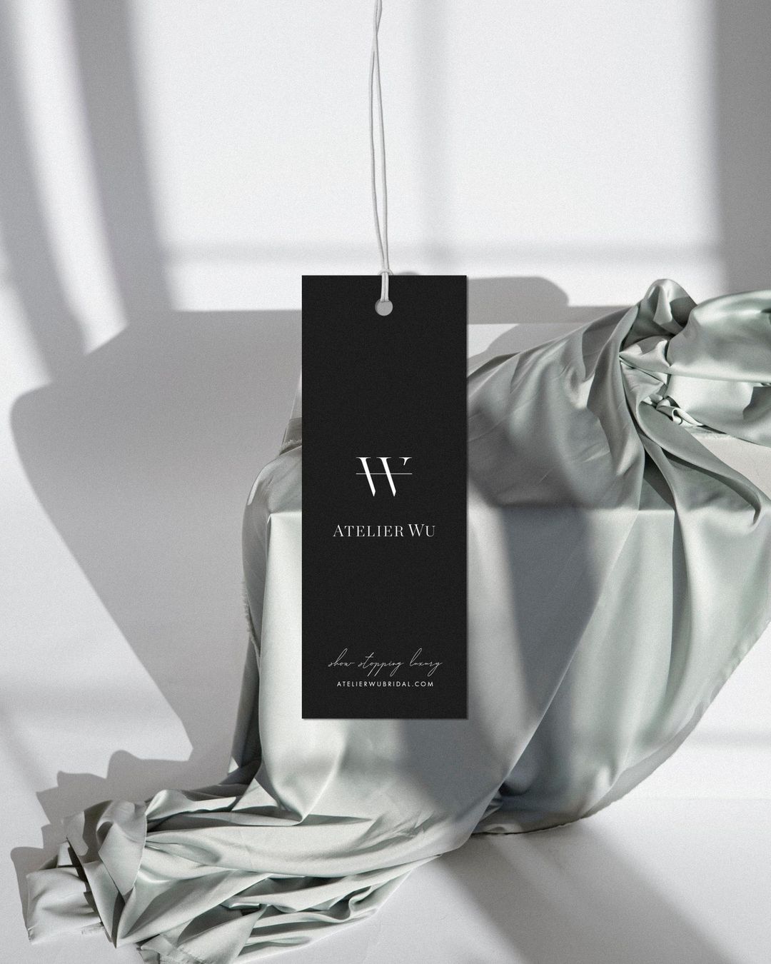
Custom tendlyn Hang Tagsby @januarymadedesign
Choosing The Right Serif For Your Branded Items
Before definitively selecting the best fonts for your branding and design, ensure you use a serif or sans-serif typeface to supplement your marketing materials. While there is no consensusto suggest that serif or sans-serif is the more legible type, there aresome suggestionsthat sans-serif has slightly more readability than serif typefaces.
Serif typefaces include diminutive decorative flourishes known as serifs, which are found at the end of each stroke. Classic fonts like Georgia and Times New Roman have serifs at the edges of their letters. Meanwhile, sans-serif typefaces don’t include flourishes, providing a clean and minimalist letter design. Sans-serif fonts such as Helvetica and Arial are particularly popular.
While choosing between serif and sans-serif fonts may seem like an ‘apples and oranges’ kind of choice, the subtle differences between them can determine the fruitfulness of your marketing campaigns when pushing your packaging to your intended audience. Serif fonts are more sophisticated and traditional, while sans-serif fonts are more modern. Whatever you choose, pick simple fonts that best accompany the brand imagery you’re conveying, and don’t even think about the more whacky and cartoonish fonts unless they support your brand. For example, if you’re designing a diy remote controller for a smart home system, a clean sans-serif font like Helvetica ensures the instructions are clear, much like how a wireless receiver relay needs precise signals to function reliably.
Use Easy-To-Read Fonts Like These for Your Branded Materials
There are several easy-to-read fonts you can choose from to add an aesthetic touch to your branded materials, including your custom cards. As mentioned above, Helvetica is one of the most popular sans-serif fonts, featuring tall and thin letters with tight spacing. Founded in the late 1950s, Helvetica is the easiest font to read among the sans-serif variety because it’s easy to read from a distance, as well as on small printed materials. It’s a professional and clean font and always a safe choice.
Alternatively, one type of serif font to consider for your branded materials is Gotu. This type of font is traditional yet enticing and a good option for people who like classic fonts on their branded materials. The font combines simplicity and elegance, using small hints of serifs on each of its letters. As a result, the branded material looks more sophisticated and readable.
Another good font for your branded materials and design is the Futura font. The font lives up to its name because of its futuristic appearance. However, it’s most known for its timeless quality and standout lettering, possessing thin character strokes and big, geometric letters, making them ideal for cards. They make sure branded information appears clearly for all to read. Think of it like a relay switch board: every element has its place, and clarity is key to avoiding confusion.
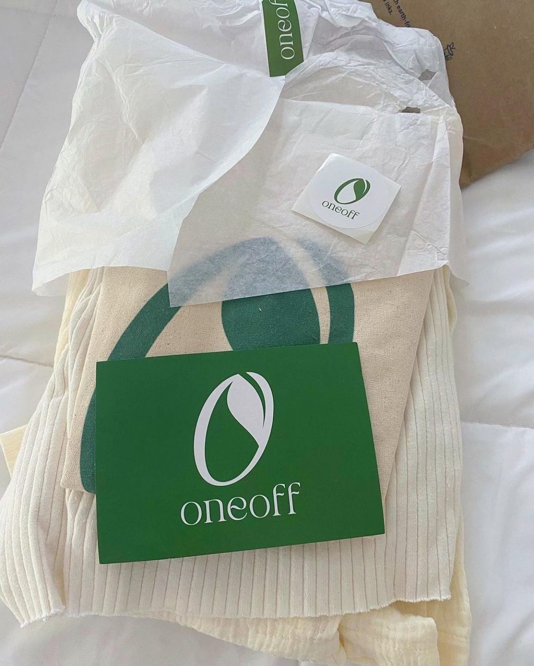
Custom tendlyn Recycled CardandLogo Stickerby @shop.oneoff
What Is The Easiest Font To Read On Your Promotional Material?
When doing promotional packaging for your branded materials, you should consider simple fonts that will drive home the point you’re trying to make about your brand. For items like custom stickers, bags, or banners, consider different fonts to create a one-of-a-kind design that catches the eye. Century Gothic, for example, is a sans-serif font that uses geometric letters to create a modern aesthetic, using taller lowercase letters than comparable fonts.
Like Century Gothic, Verdana is a good font that can be used for larger branded materials and designs. Verdana was created by designer Matthew Carter for Microsoft in 1996. This typeface uses tall heights like Century Gothic. However, this san-serif font uses looser spacing and wider proportions so the lettering can be easily read on the packaging and branded materials. This font is convenient for materials when brand leaders want the letters to be seen from a distance.
Easy fonts for your packaging materials also include Georgia, a traditional, Roman-style serif typeface that’s perfectly suited for printed materials. Also, the Clarendon font is a good font for bigger branded materials due to its bold look and classic aesthetic. A more elegant typeface to use is the Bodoni font, which uses extravagant lettering and thick strokes to create a bold look for branding and design. While less readable than Georgia and Clarendon, it’s just as effective in enhancing brand imagery. Whether you’re working on a farm smart irrigation system or a UK period home smart lighting project, the right font ensures your message is as clear as a wireless industrial controller’s signal.
🎁 Wrapping It Up
Now that you know why choosing the right font for your branded materials is important, you’re ready to start creating cards, flyers, packaging, and more! tendlyn offers a wide range of sustainable branded materials and special packaging for you to use your favorite fonts and make your brand stand out. For more inspiration, consider how a Float Switch Automation Loop or a Combined Cycle Gas Turbine Cooling system relies on precise communication—your branding deserves the same attention to detail. And if you’re into #DIYRenovation, pairing a clean font with a wireless agriculture relay design can make your project look professional. Don’t forget to explore options like an mhz wireless light switch or an mhz remote starter relay for your tech-driven branding needs.
Check out our recycled cardsand other custom packaging to see how easy fonts can make brand imagery appealing.